Rebrand
First off, our rebrand is not a thoughtless one. The previous logo at Studio 14 was an ageing one for a relatively young company that was still finding its voice. A company that has since then, developed its own distinct culture and core values.
Studio 14 launched 10 years ago with the previous logo, the company has since then matured from a bedroom-based startup to a team located across two countries with over 20 team members on its roster.
Right now, we’re at a pivotal stage in our journey and as we progress from a service agency to a digital product studio, now is the time to rebrand and move Studio 14 forward. This includes the restructuring of our website and company strategy.

At Studio 14, we believe our identity is key in defining who we are, what we do and what we hope to achieve as an organisation. The time to rediscover ourselves is now.


We use technology to simplify people’s lives, whether it is with their work, or just by making everyday processes less gruelling. As a company, we strive to develop unique products that fix real-life problems and we believe our new logo encapsulates that. Our ideas and solutions begin outside of the box and this logo mirrors our innovative thinking.
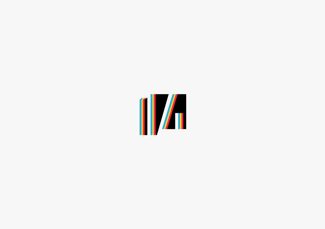
With bold clean lines and the use of negative spacing, we’ve tried to highlight how the number 14 breaks through the box. Whilst we have always been a colourful brand, we are moving away from a single primary colour to a range of bright colours. The use of these colours represents the youthful energy within the company. We pride ourselves on being of the digital age, so why not look like it.

In the coming days, our new logo will appear on our visual assets, our new website, and our social media pages. So keep your eyes peeled.
If you’d like to know more about our creative design processes, get in touch with us at daniel@studio14online.co.uk.